Sunday, January 10, 2010

Crystal Ball

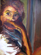
I had a many problems executing this painting. At first it was just drawing issues with the hand and separating how things looked when they were in front of me versus when they were reflected. I also had trouble with the composition being confusing and the background coming forward. After my second crack at it I think that it turned out nicely. It was really fun exploring how have bright colors and trying to make them gray enough to push them into the background.
Monday, December 7, 2009
Blues vs Orange Finished Product

This is the last painting in the series. It is my favorite especially with the background. I think that it shows a great progress. I love the vividness of the colors and how they contrast each other. My favorite thing about the whole series is that you don't see my face, yet you can get a sense of me. Mostly my strength and stubbornness is shown through this pose as well as how I see myself as a woman.

Crown of Light

This is a painting I did earlier this year, but forgot to post. I did this on cardboard that had small divots in it like an egg carton. This was a quick simple painting, but I think that the color usage really captures the face. The biggest challenge was trying to figure out the background and whether or not to leave everything out or to detail it. I really like how it came out with just colors. It makes the figure look like it is starting to glow and wearing a crown of light.
Friday, December 4, 2009

Tuesday, December 1, 2009
Smith Island


These are some pictures I took at Smith Island. It is a beautiful little island in the Chesapeake Bay that has no cars! Everywhere you look there is a painting. It is peaceful and inspiring.
Monday, November 30, 2009
Catch Up
 Blues vs. Oranges
These two paints are my most recent from over the long holiday weekend. They are part of a triptych which I am working on. Here I am interested in heightening the natural color of my skin and worki ng with contrasting colors. Especially in the second one. The third painting in the series is going to be a side shot of my arm. Also I am exploring a self portrait with using the normal "mug shot" as my teacher would call it.
Opposites
 For the last week I have been working on this painting. Here I am working with warm and cool colors. I am playing with them and seeing how they can really make a difference in whether something is receding into the background or pushing up to the front. I still need finish the figure in the background and figure out what the scenery is.
Puzzle

Subscribe to:
Posts (Atom)